Community Projects
A growing collection of interactive data maps built with DataMapPlot. Each entry links to a live visualization and the source that produced it.
If you’ve built something with DataMapPlot that you’d like to share, see How to add your project for a copy-pasteable template.
Semantic Map of GitHub
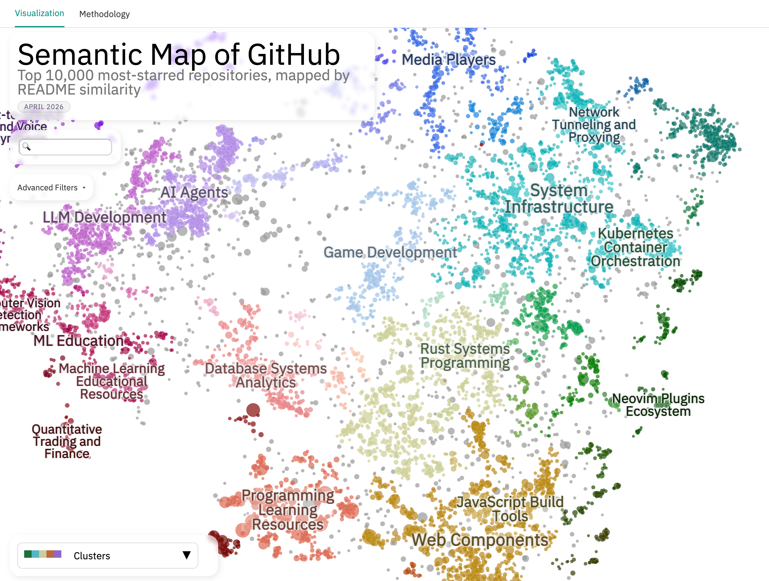
An interactive map of the top 10,000 most-starred GitHub repositories, positioned by semantic similarity of their READMEs. Eleven colormap layers slice the map by raw GitHub signals (primary language, stars, license, creation date) and LLM-derived ones (project type, target audience).
Built with Cohere embed-v4.0 embeddings and Toponymy + Claude Sonnet for topic labels.
Semantic Map of HuggingFace Datasets

An interactive map of the top 5,000 HuggingFace datasets, positioned by semantic similarity of their dataset cards. Twelve colormaps span both HF metadata (task, modality, license, language, likes, downloads) and LLM-extracted classifications (subject domain, provenance, training stage, format, benchmark vs. training role).
Built with Cohere embed-v4.0 embeddings and Toponymy + Claude Sonnet for topic labels.
AI & Mental Health Research
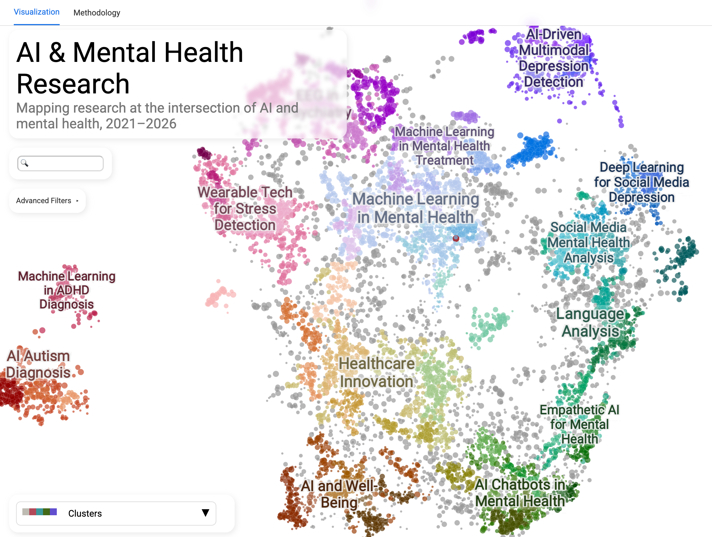
An interactive map of five years of research papers at the intersection of artificial intelligence and mental health, sourced from Semantic Scholar. Useful for surveying the landscape of AI applied to mental health, with bibliometric colormaps (citations, influential citations, h-index, year) for surfacing well-cited or recent work in any subfield.
Built with SPECTER v2 embeddings (purpose-built for scientific text) and Toponymy + GPT-4o for topic labels.
OEIS Semantic Map
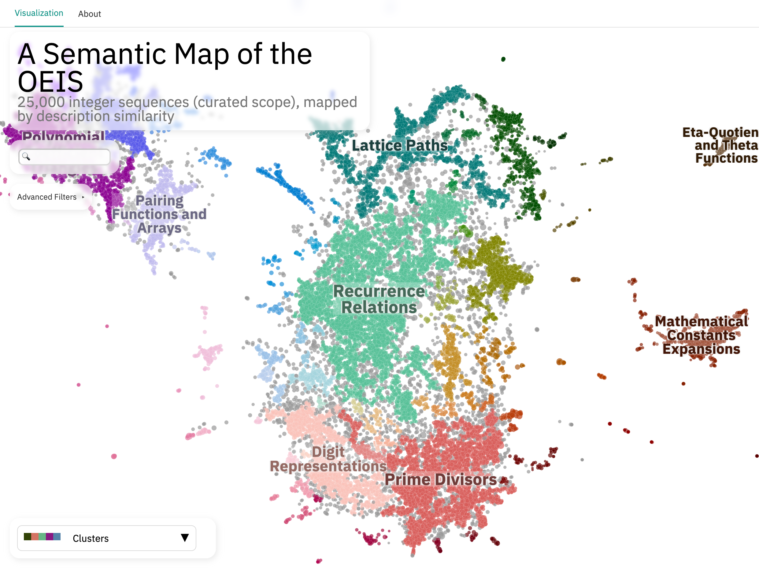
An interactive map of 25,000 curated integer sequences from the Online Encyclopedia of Integer Sequences, positioned by semantic similarity of their textual descriptions. Useful for navigating the OEIS by content similarity rather than by sequence number, with an LLM-extracted taxonomy (math domain, sequence type, growth class, origin era) available as colormap layers.
Built with Cohere embed-v4.0 embeddings and Toponymy + Claude Sonnet for topic labels.
Claude Code Changelog Analysis
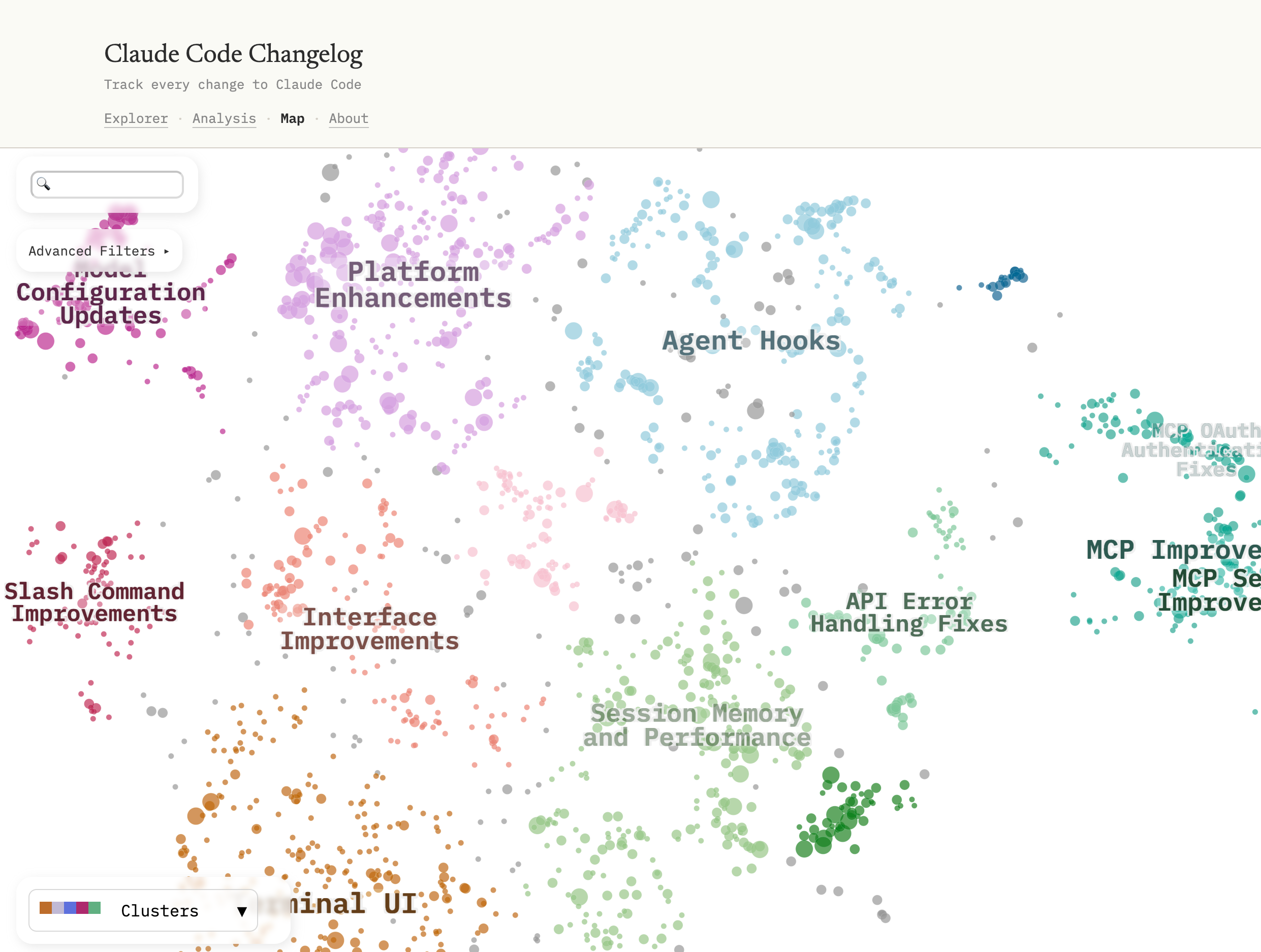
An interactive map of all entries in the Claude Code CHANGELOG.md,
positioned by semantic similarity of the entry text. An example of mapping
a project’s own development history rather than an external corpus, with
LLM-classified category, change type, complexity, and audience all available
as colormap layers.
Built with Cohere embed-v4.0 embeddings and Toponymy + Claude Sonnet for topic labels.
Every Video from One Hour on TikTok
by Ben Steel
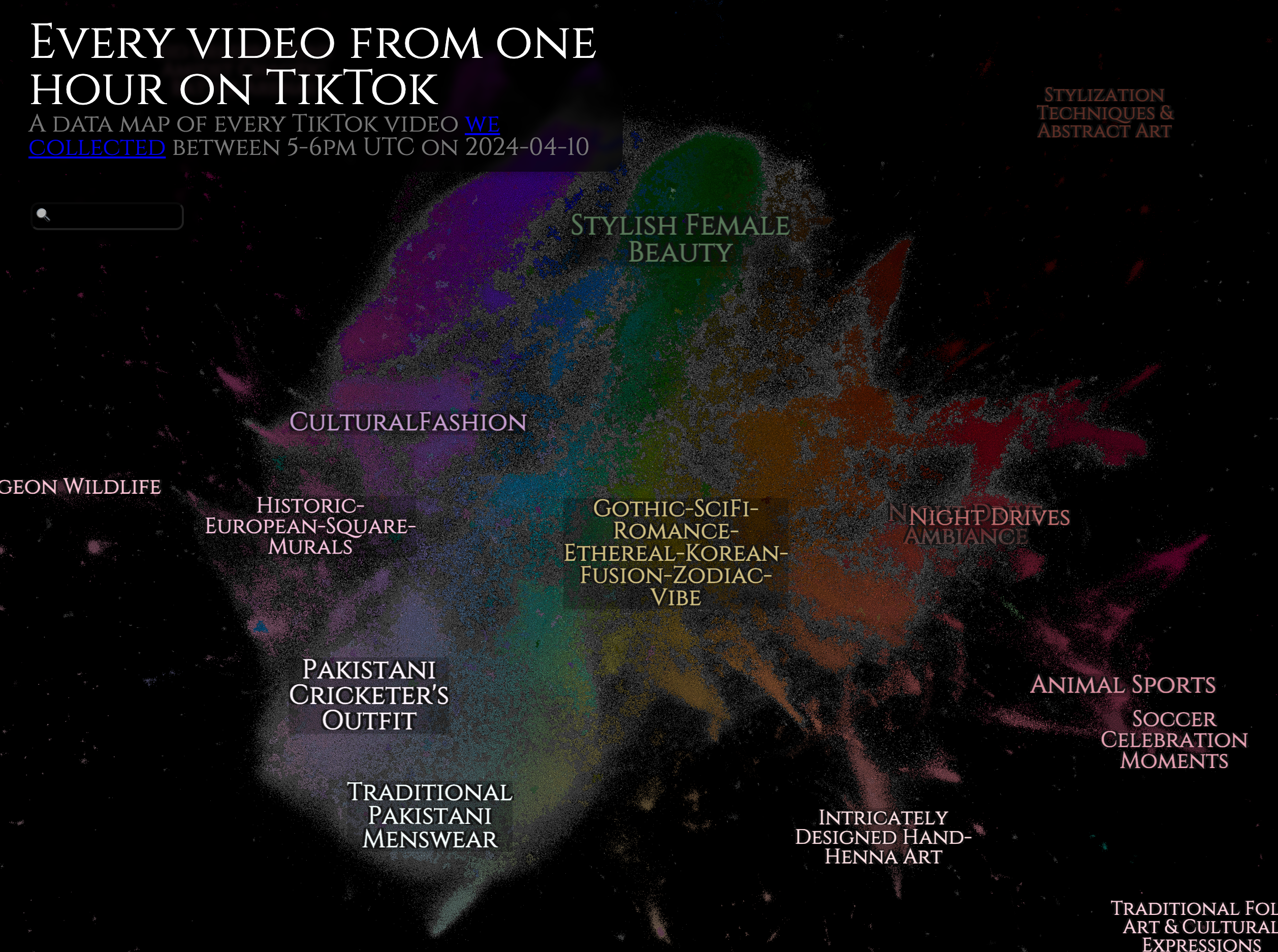
A semantic map of every TikTok video posted between 5-6PM UTC on April 10, 2024. The corpus is a “complete slice” of the platform, made possible by reverse-engineering the video-ID space.
Built with X-CLIP video embeddings (microsoft/xclip-base-patch32) and Toponymy for topic labels.
Particle Lenia Explorer
by Ben Steel
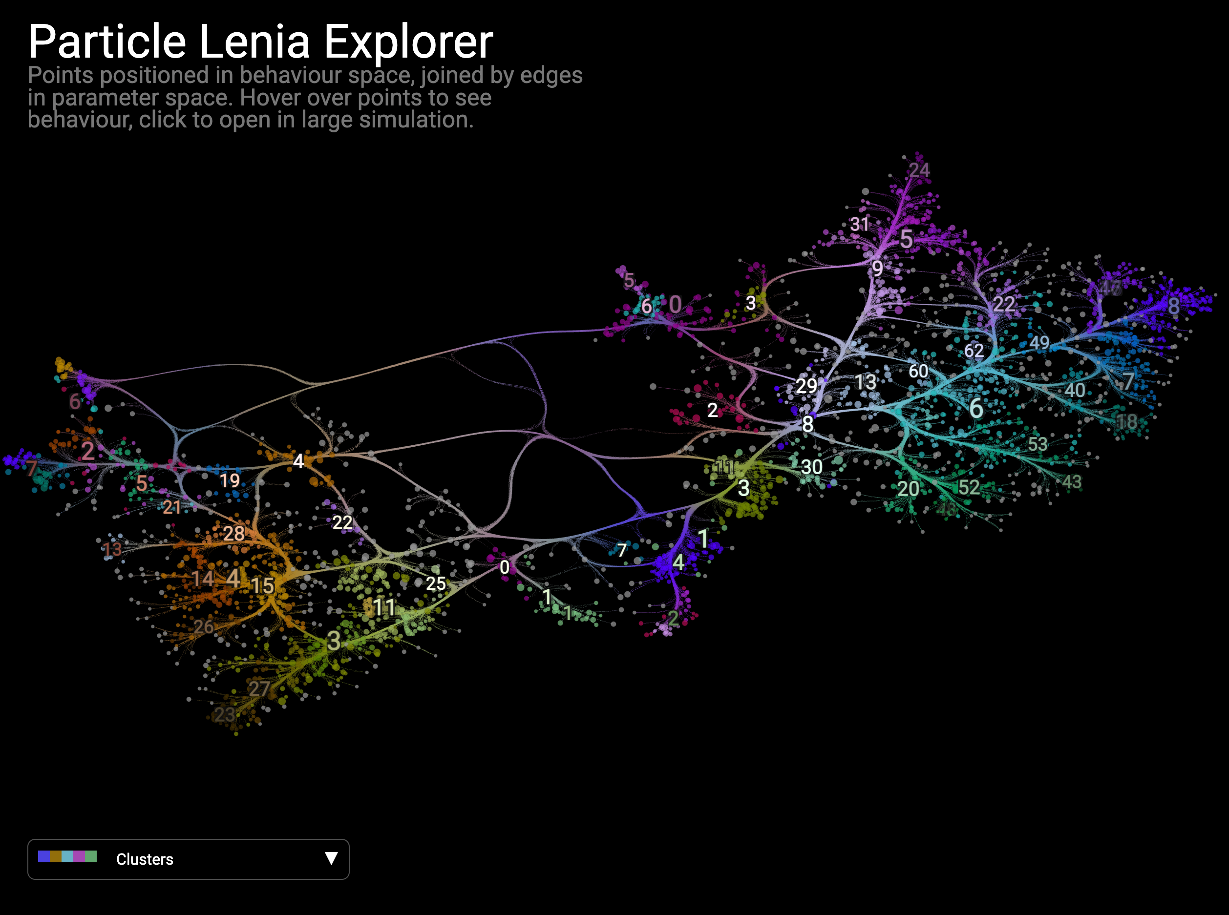
An interactive map of instantiations of Particle Lenia (a continuous cellular automaton), positioned in behaviour space with edges connecting parameter-space neighbors. Click any point to launch the corresponding live simulation.
Built with CLIP embeddings (openai/clip-vit-base-patch32) of simulation states and Toponymy for topic labels.
How to add your project
If you’ve built something with DataMapPlot that you’d like to share, please open a pull request adding an entry to this page.
Each entry has:
A title and short description (one to three sentences)
A link to the live visualization and to the source repository
A static screenshot (PNG, at least 1440 px wide so it stays sharp on Retina) placed under
doc/images/community/Optionally, an italic one-liner naming the key tools or methods that distinguish your map (e.g., embedding model, topic-labeling LLM, clustering library, custom widget)
You can copy the following template as a starting point. Place your entry wherever fits best alongside the existing ones:
Project Name
------------

*by* `Your Name <https://github.com/your-handle>`__

.. image:: images/community/your_project.png
   :width: 720
   :alt: Brief alt text describing the visualization
   :target: https://your-live-map-url/

One to three sentences describing what your project maps and what makes
it interesting.

*Built with [the key tools or methods that shape your map].*

* `Live map <https://your-live-map-url/>`__
* `Source <https://github.com/your-handle/your-repo>`__
If this is your first time contributing to an open-source project, the contributing guide walks through forking the repository, building the docs locally, and opening a pull request. Feel free to ask in the PR discussion if anything is unclear.